Some Reflections on an Illustration of Equality vs Equity
February 22, 2016 3 CommentsATTENTION FRIENDS! Can you use the equality vs equity illustration in your book/video/presentation/etc?
Yes! You do not need written permission to reproduce the work. Read below for information on the license under which the illustrations are released.
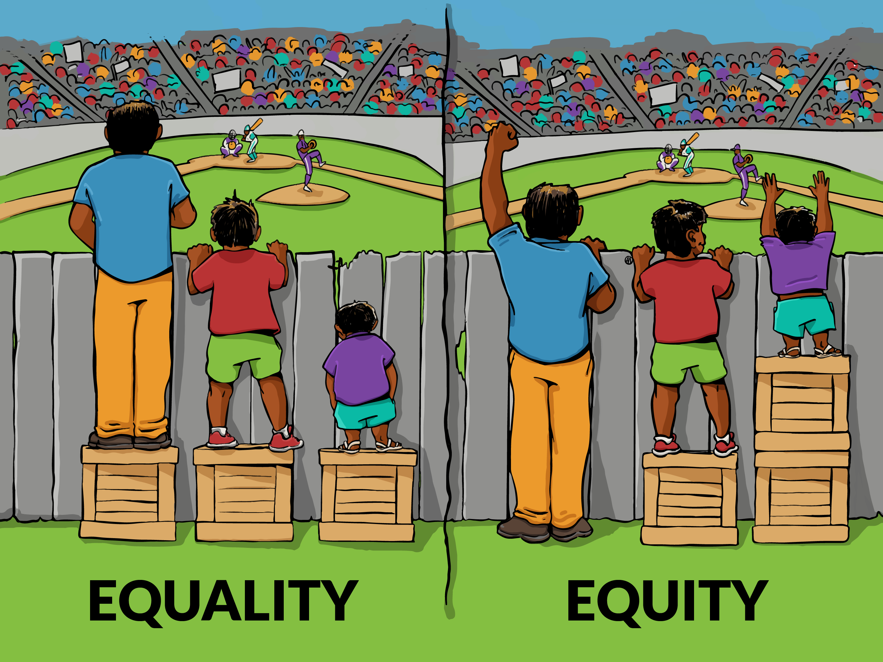
In late 2015, Danielle and I collaborated with our friend and colleague, Angus Maguire, to produce the above adaptation of an old favorite (original blog post here). In the wake of the virality of the graphic on our social media channels, the three of us wanted to share a little of what we’ve been thinking since we released it into the wilds of the Internet a little over a month ago. – Lawrence
Lawrence: In all honesty, frustration was a primary driver of my interest in this project. I have seen this graphic in 15+ presentations and yet every time it seemed to be more pixelated than the last. I wanted our practitioners (and the world) to have a higher quality tool.
Angus: Collaborating with IISC on this little project was great. It wasn’t a complex project brief: essentially we set out to improve on the presentation of an internet classic. For me, it started as a great chance to experiment with a new illustration workflow – this is the first time I’ve done a cartoon like this digitally, start-to-finish. Software and hardware tools are now at a point where that’s possible for me, and I’m just getting started on the possibilities for experimentation and iteration.
Danielle: This image is popular because it creates an opening for more conversation. What works about it is that there are multiple points of entry. For the person who has never thought about equality or equity, they can see there is a difference, and begin to shift their thinking.
Angus: My design and illustration work involves amplifying marginalized voices and communities, and creating visuals that support social justice messages. But this project had a twist. Normally, I’m thinking about diversity and specificity in terms of identity: raising up our movements’ many participants’ and leaders’ identities. But we chose to dampen that urge here, to make sure the message remained clear – that the variables at play were the resources as represented by the crates and the access dictated by the character’s height. The result, I think, remains clear. But it also seems to trigger a lot of imagination, as viewers can immediately iterate on the basic meaning, either through critique, or by expanding the basic set pieces to illustrate other related concepts. That’s what makes the project feel the most successful to me: the way it starts conversations.
Lawrence: I was (and still am) torn about the aesthetic identity of the characters in the cartoon. In the original, the three main characters are light-skinned (arguably, white) and the racial identities of the baseball players is unknown. For a few days during the production process, we batted around different identity options (gender, skin tone, body size, sport/game/event depicted).
In the end, my advocacy was to just darken the skin tone of the characters for two reasons. 1. Whenever other changes came up, they complicated and distracted from the graphic’s core message. 2. Because not everyone in the world is white and sometimes it’s just nice (word choice?) to see people of color represented. I still stand by my original advocacy to darken the skin tone of the characters because the purpose of the cartoon is to quickly communicate the difference between equality and equity. And yet, I think there is still something to be worked out around the identity of the characters.
Danielle And as many of our blog readers commented, there are 101 ways to portray the setting, character identities, and question whether or not equity is a bold enough frame. Audiences have been imagining who is inside the stadium, why the characters on boxes are outside, and details about the character’s lives that can’t actually be discerned by the facts in the image. This is what people do – fill in the gaps with their beliefs, questions, fears, and hopes.
Lawrence: If the identity of the characters creates a psychic block that prevents a viewer from getting the meaning, that’s a problem. We’ve also heard that making the characters have darker skin reinforces that people of color are freeloaders. That’s more problematic for me than having (yet another) thing centered on characters perceived to be white. Maybe we’ll find a way to remedy that some time in the future…
Danielle: Like many things that become popular, this illustration simplifies the matter. Could any single frame, digestible at a glance, truly engage the whole issue? Since January, 2016, this image has provoked at least 60,000 conversations about equity that may never have occurred, and who knows how many the original rendition did before that. It demonstrates that a simplified message can open up into a complex conversation.


3 Comments
Hi Danielle and Lawrence,
I would LOVE for you to read this blog by Dr Aasha Abdill and for the three of you to have a conversation (which we can read) about this graphic. I found Dr. A’s analysis profound and it has shifted my understanding and use of the graphic (confess I have shared via social media)
https://www.linkedin.com/pulse/problem-image-its-what-you-think-insidiousness-implicit-abdill?trk=pulse-det-nav_art
Happy to connect the three of you.
Hi Jara,
Some of us at IISC were actually chatting about Dr. Abdill’s piece just last week. A connection would be great! Feel free to connect us via our email addresses: lbarrinerii@interactioninstitute.org and dconnor@interactioninstitute.org.
Looking forward!
Hi Jara,
Some of us at IISC were actually chatting about Dr. Abdill’s piece just last week. A connection would be great! Feel free to connect us via our email addresses: lbarrinerii@interactioninstitute.org and dconnor@interactioninstitute.org.
Looking forward!